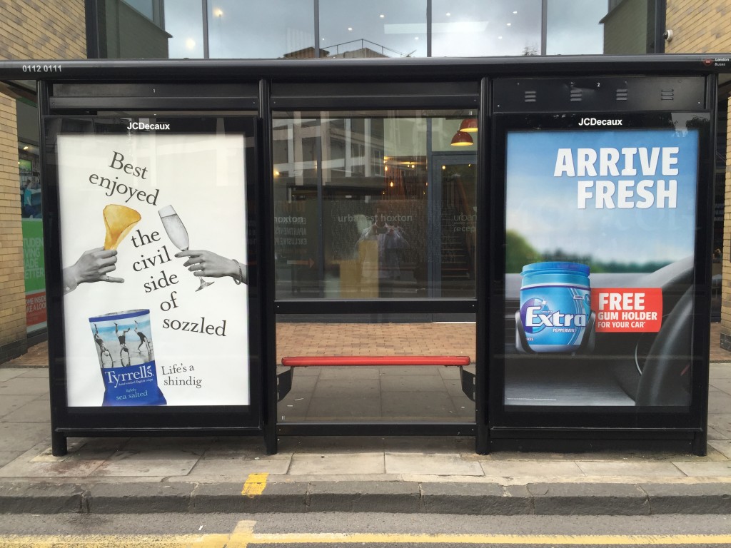
Two ads, two foods, and two very different approaches to tone. I’m not a big gum chewer, and I do like my prosecco, so perhaps I’m biased. On the right, it’s all about proposition. On the left it’s all about tone. The use of words like civil and sozzled, shindig, even sea salted rather than just salt, all paint a picture of acceptable, maybe even necessary decadence.
The typography which is itself a little tipsy, helps remind us that being too square and sober is best left to other brands and other products.
If you’ve got to sell a pack of salted crisps, where margins are high and competition is intense, tone is your secret weapon.
